Spatial Routines

In my studio teaching I often talk about routines rather than programme, function or use (see Programme, Function, Use, Activity). Routines help the designer focus on the activities that take place in a space and help to avoid the unquestioned replication of solutions we ‘think’ work, make (common) sense or are obvious. Thinking about spatial routines questions the assumptions we have about programmes and functions. But more importantly it makes us think about the interrelationship among spaces rather than focusing on the function or use of individual spaces in isolation. Routines are clusters or sequences of activities that are repeated in varying time scales (we brush our teeth several times a day, take the rubbish out two or three times a week, wash the car once a month, sort our closets and wardrobes once or twice a year, etc.). The particular types of routines that help architectural thinking are those that are most spatial – that is, while brushing one’s teeth is certainly important, it is largely a stationary activity and hence spatially less interesting. Taking the rubbish out, however, often involves moving from room to room, possibly going up and down stairs, and often going outside. Getting ready for work or school also involves a sequence of activities and spaces. Many types of work involve spatial routines. But even something that might seem stationary – a museum security guard – when looked at more closely involves spatial routines such as getting lunch, going to the toilet or taking a break, not to mention arriving and departing work.

What is critical about spatial routines is that they allow us to see and focus on the interrelationship of spaces. In a house or flat, the measure of a good design is not the success of individual rooms, but the way they work together. Developing your design around routines (arrival, resting, playing, cleaning, dressing, departing, storing, etc.) will test the way in which spaces work together. The simple routine of arriving home may involve fumbling with an umbrella and keys (it’s always important to imaging your routines and designs under various weather conditions), taking off shoes, handing jackets or coats, putting away gloves and scarves, putting down groceries, storing your keys, wallet, bag, etc., and sitting down for a rest or breather. This simple routine goes beyond any particular function and extends beyond a single space. And much of what we do, at work, home and at leisure, involves multiple activities sequenced across spaces (or spatial fragments).

Setting aside programme and function and imagining some of the routines which could take place in your design – whatever  the brief – will open up design opportunities that will often step beyond the expected, traditional and repeated solutions we often get in architectural design. It will make the design process more complicated, since designing across spaces is more difficult than designing individual spaces; but it will also make you a more versatile designer and, more importantly, lead to spaces that allow for the real complexity of life that is obscured by labels.

“The concept of everydayness does not therefore designate a system, but rather a denominator common to existing systems…” – Henri Lefebvre

rietveldschroderhuis.nl

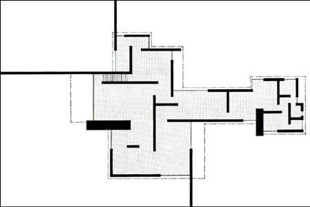
Ground floor, Schroder Huis, Utrecht (Gerrit Rietveld & Truus Schroder). This corner incorporates storage under the steps (for boots, etc.), bench and storage built around the idea of arriving into the home. All of the preparation happens on this little ‘stage’ before sliding the door which reveals the stair leading up to the main, and more famous, floor of the house. It’s a mini-routine that happens as one ascends and transforms what would have been distinct and separate single use elements – stair, cupboard, furniture, chair/bench. Image from rietveldschroderhuis.nl.

Street View Bickershoek

Bickershoek School and Housing (Herman Hertzberger). This entry element weaves several routines together which would normally be considered distinct design problems leading to separate solutions. The projecting box is the entry lobby for the school which uses the terrace above as a canopy to provide shelter in inclement weather. The terrace is off a lounge area for teachers, and outdoor space providing both spatial relief from the interior and a point of observation down to the play spaces below. The terrace is supported at one end by a thin metal plane which doubles as a backrest for the integrated bench, which in turn is a structural element anchoring the plane down to the ground. The void under the terrace makes an entry ‘archway’ into the school but also provides a framed passage between the upper and lower playground while also being a congregation area for children. This design element cannot be seen simply as an ‘entry lobby’ or ‘entry’. Rather it is the result of routines such as arriving, waiting, sitting, sheltering, relaxing, and observing, combined in such a way as to link separate activities in a greater whole than the sum of its parts.


Plinth and Void as Mediator to Ground

From a distance Aalto’s block for the 1957 housing exhibition appears as a slightly cranked slab block. This does, in fact, represent the strategy of the block above the ground level. However, entry is via a void between the two outer parts of the block. The groundscape of this entry void does not follow the outline of the building above – it extends in places beyond the outline of the upper block. The groundscape is a plinth (base or platform) that subtly reaches out into the surrounding site to ease residents into the entry lobbies. It is a covered exterior space paved with cobble stones to maintain the sense of exteriority. Note that the cobble stone ground continues beyond the plinth level out into the landscape. The structural columns interrupt the void space exposing the geometrical resolution of the crank in the slab above (see the paired columns in the middle of the space. Their spacing appears irregular but follows a strategy that sets up a central space within the void. The idea of this void as a continuation of the exterior is reinforced by the resolution of the railings which ‘float’ over the plinth ground. It is only where walls lead into the lobbies that the low wall railings meet the ground, as if to begin the process of constructing an interior. This is further accentuated by two steps leading up to the lobby doors. The void is articulated with benches that provide various focal points within the void, as does the paint scheme on the ceiling.

There are different points of integration between the plinth and the overall slab-form. On one side it is made by the grey band that continues around the entire building, making a material distinction between the zone that touches the ground and the white exterior surface of the dwellings. On the other side, where the ground drops more dramatically away from the plinth level, the outer surfaces are painted white and seems to continue the building form right down to the ground (although the grid patterning isn’t replicated in this area.

The key lessons here are:

  • The idea of an exterior room as a threshold
  • The use of a plinth to mediate building and ground
  • The development of the plinth as an element in itself (it does not follow the outline of the building above)
  • The reaching out into the site to mark and draw residents inside
  • The use of structure to articulate zones and spaces in the void
  • The reinforcement of spatial ideas through material decisions
  • The reinforcement of spatial ideas through detail decisions (‘floating railings’)

Mediating the Horizontal and Vertical

This entry considers the way in which the vertical form of the Unité d’Habitation by Le Corbusier mediates with the horizontal of the ground (the site). The overarching strategy is that of lifting the body of housing to allow the ground to continue, uninterrupted, underneath what would have been a physical barrier between the eastern and western parts of the site. Added to this is a concern with the ground as a natural field. Although Le Corbusier’s own sketches suggest that he wants a continuous natural landscape to pass underneath the building, in fact, there is a different ground condition underneath the slab (i.e. it is a paved, hard ground-scape). So we must assume that it is the continuity of space that is more important alongside a recognition that it would be difficult to grow anything underneath the building itself.

‘Natural’ and ‘biological’ metaphors are used throughout to accentuate the strategy of how vertical meets horizontal. The overall section is conceived like a body; it has legs (pilotis), a body, a heart (the rue intérieure), and a head (roof garden). The piloti are constructed with organic overtones, tapered like legs, rendered in béon brut accentuating the natural grain of the wood shuttering used during the pouring of the concrete. In the interior lobby the concrete is ‘stippled’ with sea shells.

This particular detail isn’t directly related to the problem of related horizontal and vertical conditions but is part of a theme that contributes to the broader strategy employed by Le Corbusier – and perhaps even fair to say it is representative of his philosophy, his world-view (specifically, the role of nature in considering human culture and its artefacts).

The strategy of lifting the housing to accentuate a continuous ground is underscored by the way the organic entry lobby form floats underneath the slab as a semi-independent element. It’s structural, formal and spatial logic are completely different from that of the slab above.

There are several key lessons to take away from this:

  • Le Corbusier takes a clear position with respect to the site, the ground and how a vertical building should meet it. This is not taken to mean that the solution is good, preferred or that it works (that is up to you, with further analysis).
  • A strategy for resolving a problem (the meeting of vertical and horizontal), for establishing a relationship or for joining two elements, could be to not let them touch, to mediate to a gap, space, or a void.
  • Understanding the larger strategic intent (horizontal-vertical relationship) can make clear to you how to proceed with smaller strategic decisions (making of the entry lobby, floating glass vestibule in lobby), material decisions (concrete, texture, form), details (canopy-lobby detail, column-floor joints).

Centred, Peripheral and Dispersed Plan Types

Modernist discourse on space often proposes an opposition between spatial organisations that emphasise the centre versus those that emphasise the periphery. Classically planned buildings nearly always put the emphasis on the geometrical centre of the plan (see 1 square, 4 square, 9 square). Modern architects, in their attempt to link interior and exterior space, put the emphasis on peripheral spaces often eliminating a central space altogether. Since the middle of the last century another plan type, dispersed, did away with emphasis on either centre or periphery. This plan type reinforced the idea of networks, nets or labyrinths rather than fixed geometrical figures. For a time these inflections reflected cultural and social belief systems of their time.

Today we can plan as we like; there is no longer a dominant or shared ‘universal’ spatial order.  If anything, our pluralist contemporary values suggest that we must employ a variety of approaches rather than enforce any single one. In addition, we no longer see centralised plans and its implied hierarchy as inherently bad. It therefore becomes more important to understand the effects and implications of centralised, peripheral or dispersed organisations. For example, we should not see these as just geometrical ‘games’ but as different types of spatial intentions. Although modernist plans often avoided centralised spaces they often reinforced a non-geometrical centre or focus. In the work of Frank Lloyd Wright this was often the hearth; for Le Corbusier it was the double height space, designed as the social heart of a project but located peripherally. Read this was we can see that modernist plans had their own hierarchy even while displacing the symbolic centralised space of classical planning. Dispersed plans might be said to privilege movement rather than any particular space or object.

Although we are now free to use any plan type without the restrictions of a single cultural reading or technological constraint, locality and specificity of place can generate a meaningful choice of plan type. In addition, the plan type is no longer an automatic choice (based on the architect’s rigid belief system) but often evolved through a process of design investigations. Nevertheless, you are likely to eventually arrive at one of these plan types. The question to ask is whether the design intention is utilising the right tool (plan type) to be effective and communicable.

Source: Le Corbusier

Villa Rotunda, c.1580, Andrea Palladio. This is a classic nine-square plan following the geometrical schema quite closely. There are subtle adjustments worth noting: the circular central space emphasizing its importance; a non-symmetrical north-south versus east-west layout; achievement of four different scales in room sizes.

Villa Rotunda, c.1580, Andrea Palladio. Typical centralised and hierarchical plan

Frank Lloyd Wright, Martin House, 1906

Frank Lloyd Wright, Martin House, 1906. Peripheral plan with hearth at centre.

Le Corbusier, Maison Citrohan, 1919.

Le Corbusier, Maison Citrohan, 1919. Non-centralised plan with double height social space (at bottom).

Aldo van Eyck, Orphanage, 1962.

Aldo van Eyck, Orphanage, 1962. Example of dispersed or network plan with an emphasis on movement circuit.

Sanaa, Moriyama House, 2005.

Sanaa, Moriyama House, 2005. A contemporary dispersed plan. Note that this plan avoids reinforcing a centre, periphery or a movement system. In this case it is being used to neutralised as many aspects of space as possible.

Six Conditions of a Cube

A definition of a cubic space that is based on the idea of 6 equal sides is useful for mathematicians but restrictive for architects. Imagine instead that you define a cube as a space determined by six different conditions. The top and bottom are easily distinguished: one is a ceiling and the other a floor. As such their roles, materials and effects are considerably different. The remaining four sides can also be differentiated if you consider something as straightforward as sun orientation. Put into a context the four vertical sides of a cube would have four distinct relationships to light. One of your sides might contain an entry, thus rendering one side a ‘front’, one a ‘back’ and the other two as ‘sides’. If in your particular context the side on the left has a space outside of it that is different to the one on the right then these sides can start to take on different characteristics.

From this point of view a cubic space and its resulting characteristics is really something that emerges from the specific conditions that define the perimeter. Put another way, you should never conceive of spaces as abstract cubes, blocks or hermetic rooms. Every space that exists in the world has an orientation. Therefore, it requires more energy and explanation to conceive of and defend a space that is undifferentiated. It should be normal, rather than exceptional, that spaces consist of defined boundaries that differ, rather than consist of walls with holes in them.

How does this help?

This should help you consider all spaces as being determined by their location and relation to other spaces rather than conceived as isolated or abstract volumes. The cube in this discussion is nothing more than a stand-in for any space that you may be designing.

Source: There isn’t a precise source for this idea, but it is exemplified in the way Le Corbusier designed his spaces.

The triple height entry hall of Le Corbusier’s Villa La Roche exemplifies this approach very clearly. The floor and ceiling are self evident in their difference. The four sides can be defined as such: 1) East facing side – entry, crossed by a bridge that links the gallery and residence; 2) South facing side – circulation with overlooking balcony with library overlooking at top level; 3) West facing side – blank, no articulation, acts as a foil for the other three sides; 4) North facing side – circulation, both vertical and horizontal. The four sides could be defined as entry/bridging, overlooking into cube, reference wall, and movement wall. Each side acquires a conceptual as well as functional role giving the space a dynamic character. I would also note here that this idea works not just abstractly as seen in an axonometric, for example, but experientially. The south side provides bodily experiences of the three levels, floor, middle and ceiling. The East is crossed by a bridge that links and relates interior and exterior. The north side is experienced through stairs and passages that run both parallel and perpendicular to the space. Only the west wall remains purely visual and abstract.
The main space in Chareau’s Maison du Verre is a cube-like volume with 6 distinct sides. Leaving the floor and ceiling aside, the four vertical sides can be understood as: wall of light (right), wall of books (directly ahead), screen ‘wall’, and circulation/services ‘wall’. Two of these, the glass block wall and library are flat and abstract, and work together as a planar ‘L’ configuration. The other two are not so much walls, as thick zones of activity. What I call the screen wall is a storage/shelving/railing system (just visible at left)  that partially obscures a passage way leading to bedrooms. The fourth wall, which is not seen in this photo (it is where the photographer is standing) is another thick zone of activities – horizontal and vertical circulation, storage and service spaces. These two thick and occupied zones compliment the two planar ones.

The two examples shown here happen to be cubic spaces and were chosen because they are clear examples of the principle. As noted above, this principle is not really about cubic spaces but about the way any space can be defined as a set of conditions rather than walls.

Plan Geometry: 1-Square, 4-Square, 9-Square

You may be surprised to know that vast majority of plans can be reduced to one of these categories. These categories are generic organising strategies and the square is not to be taken literally when either looking for, or working with, these strategies. The 1 square refers to open plans with a single room or without any subdividing elements. The 4 square is a strategy in which four zones are organised around the periphery without a linking centralised space. The 9 square is a centralised plan with a clear central space (middle square) and peripheral zone (surrounding 8 squares). The 4 and 9 square represent a basic opposition between centralised and non-centralised plans, and as such provide you with a choice between hierarchical or non-hierarchical plan strategies. The 1 square can be treated as either, dependent on how the perimeter enclosure is defined.

These strategies are not absolutely necessary for making a good plan, but you will likely be working with one of them whether you know it or not – it’s better to know and understand their relative strengths and weaknesses. Each of these comes with their own range of possibilities as well as limitations.


How can these help?

When you recognise with direction in which your plan is developing you can ask yourself if the plan geometry is supporting your intentions, particularly where hierarchy is involved, or where a need for a centralised or collecting space is needed. You can also work ‘against’ the logic of the geometry in clever ways that may help your design development. For example, you may with to strengthen the different spatial characteristics of each quadrant in a 4 square scheme, so that the design does not freeze over into an overly static design. You can also ‘collapse’ or merge squares together so your plan isn’t just a diagram of a geometric strategy.

Examples: